
Four MAGIC Elements to Elevate your Decor
- Riana Bailey
- Jul 31, 2022
- 8 min read
Updated: Nov 3, 2024
Your home interior has to be pleasing for you to look at and evoke the right type of 'energy' for you to feel comfortable in it. If it doesn’t, or it just feels ‘off’ or ‘flat’ you may have ignored the elements of interior design or paid a little too much attention to one of them.
I share four of the elements that I find THE MOST effective to instantly elevate your interior décor from so-so to sensational!

What is an Element
An element can be thought of as a key component – almost like a key ingredient in a recipe.
Without the pizza base, the rest of the pizza ingredients will just be a messy pile of melted cheese, tomato and toppings. The pizza base (whether you choose standard, gluten free or vegetable based) is a key ingredient of pizza AND gives it structure. Similarly, a dish with too much salt can taste dreadful.
Without a key element your design will seem lacking. Just like too much of any one element, can overpower other aspects and spoil it.
Why use Elements in your Design Process
I don’t like to think in terms of rules when it comes to something as creative as interior design, but I DO like a bit of structure and that is what these elements provide, otherwise you may as well just throw it all together and hope for the best.
These elements are there as guidance, a sounding board if you like, to assist us in evaluating our interior creations and challenge us to think about these aspects in a way that can elevate it to charismatic.
The Magic Four Elements to Elevate your décor
There are seven elements in interior design, or at least that seems the most popular notion among professionals. Even if they agree on seven, not all of them seem to agree as to what exactly those sacred seven are.
My go to elements for instant oomph for my own designs are Emphasis, Balance, Harmony and Contrast.
You may be thinking: ‘Well, some of them kinda sound like the same thing’ and you’re right. Balance and Harmony are closely related, where Emphasis and Contrast are their counter elements. All four together creates the MAGIC recipe for delicious interior design that will leave you drooling.
There are a considerable number of ways in which you can achieve these design elements, and I can’t cover all of them here, however I will attempt to break each one down as a concept and provide a simple example, which will allow you to apply these concepts to your designs.
Emphasis
The easiest way to create emphasis in a design scheme, is to establish a focal point.

I’m sure you’ve heard the judges on Interior Design Masters exclaim these exact words when they first walk into a room: ‘I don’t know where to look!’. A focal point draws the eye, provide visual interest, anchors the scheme and most notably elevates the more principal elements of the design above those that are less important. Okay, a lot of words there… let’s break it down.
When you walk into a room, your eye is naturally drawn to the most ‘obvious’ visual item in the room. Let’s use the wrong kind of emphasis as an example: Dad’s monstrosity of a reclining chair in the middle of the living room… You know the one. Big, black, leather thing that looks like it has been involved in each of the scrums of the rugby games that Dad has been watching in it. And the chair is surrounded by light, pale coloured decor (Mom’s colours obviously). It sticks out like a sore thumb, and you notice it immediately as you walk in.

If you were to change the décor to darker colours to make the chair blend in more (lessen the emphasis on the item you don’t want to stand out), and created a focal point somewhere else in the room (emphasising the item you want to draw the attention to), the chair won’t look quite so out of place and will hardly register when you enter the room, because your eyes would naturally be guided to something else.
I am not saying you have to decorate around a single item (unless you’re telling Dad that we are getting rid of his beloved chair). It is just an example and something those (most?) of us that lived through the 80s can relate to.
Sometimes the focal point is obvious in a space: a stunning view, a grand fireplace, ornate wood panelling, a beautiful kitchen island, family portrait gallery, etc. But is can also be tricky when there are too many focal elements in a space as they compete for visual attention.

In the above example, by downplaying the décor, the designer allowed the large windows and the view to be emphasised.
Other times it is much harder to determine what the focal point when there isn’t an obvious importance to any items. This probably how the feature wall was born. Some consider it a design crime... I am not against a feature wall - a space needs a focal point, even if you must create one - however I am against using it when there are other elements that we often overlook that can serve as a focal point even better.

To establish a focal point in your design, look at ALL the items (don’t forget the physical room features and architecture) and consider which one is obvious. Try not to be led by the element that naturally gets the most functional focus in a space, for example the television in the living room. If there isn’t an obvious choice, choose one that is most important TO YOU.
Then think how you could emphasise this element to stand out more. Remember that emphasis is not only achieved by elevating one element, but also by subduing others.
Balance
Balance and Symmetry are closely related elements in interior design and we often confuse balance with symmetry.
Symmetry relates to the how objects are placed or arranged in a space. Think of two identical bedside tables, one placed on either side of a bed, creating a symmetrical (mirrored) look.
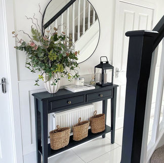
Balance does not relate to the placement of objects in a room, but rather the relationship between ALL the elements (including colour, sizes, shapes, etc). If one element dominates, the room feels unbalanced… 'off' somehow. Often, a lack of balance manifests as a sense of slight discomfort or restlessness without being able to put your finger on what it is that is causing it.

In the above example, the weight of the cooker hood against the cabinetry, island and lighting, dining furniture and colours create a beautiful balance. This is so incredibly clever! I am in love and a little jelly (if I have to admit)...
Considering again the visual items in the room. If there is too much visual stimulation, too much ‘going on’, on one side of the room and not a lot on the other side, it will feel unbalanced.

Picture this: You may have a sideboard in a dominant colour, piled with lots of styled items and an ornate mirror above it, flanked by two armchairs covered in bold print and each with a bright cushion on one side of the room and only a plain coloured sofa on other side. The sofa by itself (no matter how big it is) is not enough to balance all the ‘goings on’ with the sideboard, even though it is placed directly across (symmetrically) to the sideboard.
By adding more visually stimulating items to the couch, like some scatter cushions in the same fabric as the chairs or by taking some things away from the sideboard (it is not always about adding more) the room will already feel a lot more balanced.

A balanced interior evokes the sense of equilibrium and calm, regardless of the colours and objects used. Balance is certainly the hardest of the elements to master, but for me it is the most important as it sets the 'energy' in a room.
Harmony
Harmony is the sense that all the elements fit together, i.e. they ‘sing’ in harmony. Harmony is probably the one element most designers tend to 'get', but to 'get right' is a skill.
Let's look at some great examples where the designers did just that and I'll provide some things for you to consider when harmonising your interior.

The easiest way to achieve harmony (and is most popular) is to use a harmonising colour palette. The colours don't have to be the exact same shade, but they do need to comfortably sit together (complement each other) and the rest of the décor. In the above example, the basins and the rose gold finishes are not the same shade of pink as in the terrazzo wall and floor, yet it sits with all the other colours as if it was made to go together.

Another way to achieve harmony is through following the same interior style throughout the room (or house). For example, all the items are of the same style i.e. classic, contemporary, industrial, etc. In the above image the designer used a modern design throughout, but also cleverly used the repetition of horizontal and vertical lines and round shapes to create harmony.

Another example of creating harmony is to use the same theme or mood throughout your scheme, keep it light and whimsical, go dark and moody or bold and bright.
Contrast
Of course, all this harmonising can be a cause for blandness – enter Contrast!

Contrast is the comparison of differences between items. We’re hardwired to notice what’s different. It instantly piques our interest. Contrast is achieved by creating a heightened sense of these differences. Emphasising the differences.

An example of how to create contrast is through scale. By placing a small item next to a big item, it will make the small item appear smaller and the large item appear larger. Anyone else envious of the high ceilings in the above image? Notice how the furniture are all low pieces to accentuate the height of the ceilings.

One popular way to create contrast (and one of my favourites too) is to use different textures, for example mixing rustic, rough textures with modern, sleek textures (the above image is a total interior crush for me!).


Another simple example of creating contrast is through colour, by placing light and dark colours or two contrasting colours next to each other is very successful in creating that interest that we are seeking.
Contrast is probably the easiest of the elements to achieve as you can use so many aspects of your design to create contrast. Just ensure that the scheme as a whole still works.
How to Approach Changing your Interior
Balance and Harmony are two of the foundational elements of interior design. If you are looking to change up your interior, start with these two and ensure they are in place first. They provide a sense of calm and solidity to the design. Then carefully consider the elements of Emphasis and Contrast in terms of your personality and the personality of your home. The latter are the key to making your interior special and unique to you.
Any links provided throughout my blogs are not affiliated but based on my personal research and what I would use or recommend. Any other products shown are not intended as a recommendation for a specific product, but as examples of what is available and to provide ideas and inspiration.